

Equal CARE
Work
Equal care work – Modernizing care work and couple collaboration – A fresh UX/UI makeover for equaly
Client:
equaly
My Team:
Just Me
My responsibilities:
Concept, Look and Feel, UX/UI Design
Design from start to finish
Tools:
Figma, Miro, Slack
Timeline:
1.6.2023 – 31.07.2023 (50-60 hours)
Overview
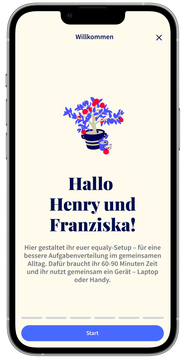
Modern makeover: Redesigning equaly for an easy-to-use, fun and mobile-first experience
Transforming caregiving for couples, equaly sought to address two major issues that hindered the user experience. The existing design lacked modernity, consistency and mobile functionality. In addition, the task distribution game, „Who-Cares-Session“, was unengaging and presented a text-heavy format.
I redesigned a visually appealing, mobile-first task overview and developed a step-by-step Who-Cares-Session that was fun to use and simplified the content while maintaining depth.
Results
75% completion and countless smiles
75% sign-up completion rate for the task distribution game. Post-release feedback highlights the process as „very intuitive and well explained.“
“My partner and I were already very far along on the subject, but the Who-Cares-session gave us a lot of clarity and some aha moments”
– Happy client

Challenge 1
Creating a seamless
mobile-first user experience
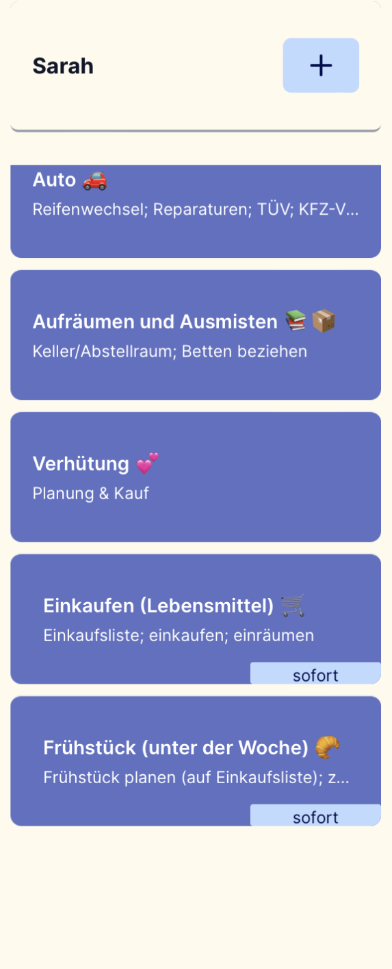
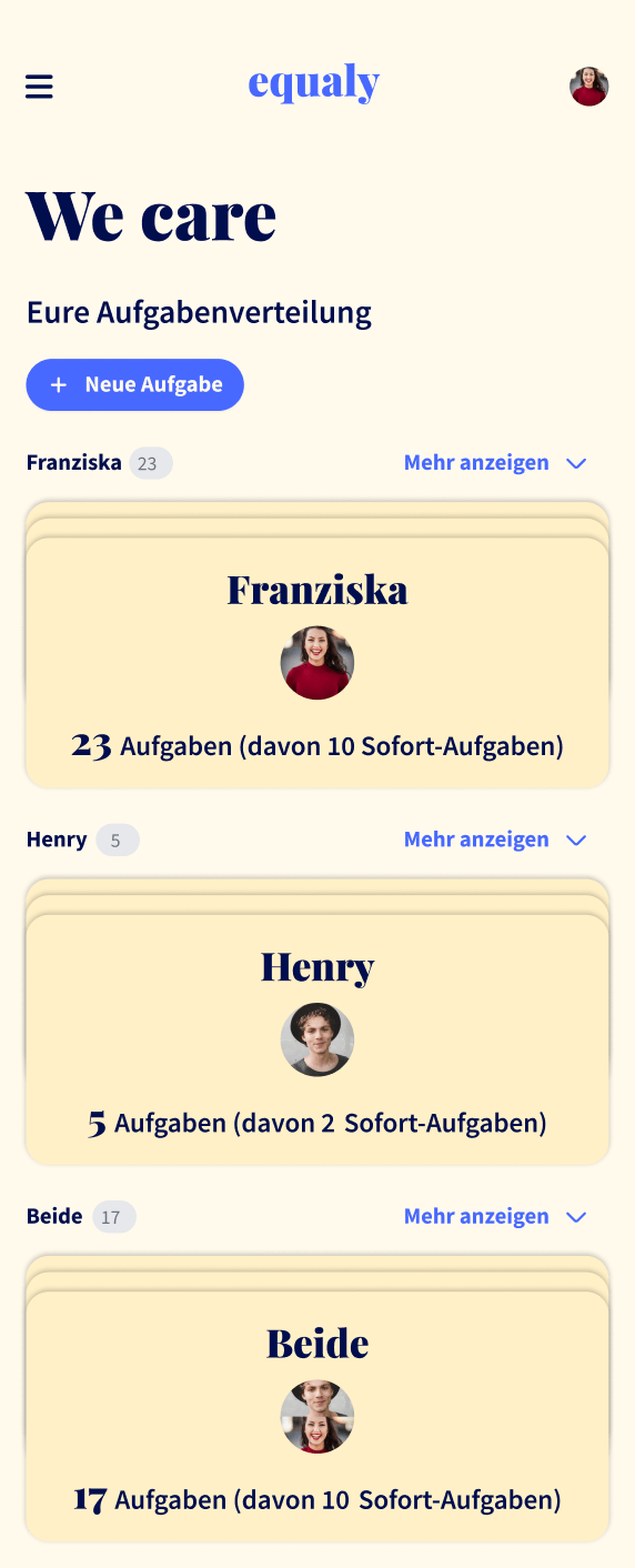
Problem: Users lacked a clear task overview and easy access to details.
Solution: Introduced an accordion pile optic for an intuitive overview with a clickable mechanism.
Outcome: Improved clarity and improved access to tasks.
Challenge 1
Clear overview of tasks with accordion-style stacking
The existing design lacked cohesion, did not meet modern standards, and had usability issues, especially on mobile devices. The dashboard and task overview were confusing because the Kanban logic of checking off tasks miscommunicated ongoing responsibilities as completed tasks.
To address these issues, the redesign included a modern, cohesive visual language. As a key change, I decided to abandon the confusing Kanban logic in favor of a stacked look with an accordion feature. Users now enjoy a clearer overview of tasks, with a simple click to expand into detailed task cards. This change not only improved clarity, but also ensured a seamless mobile experience.

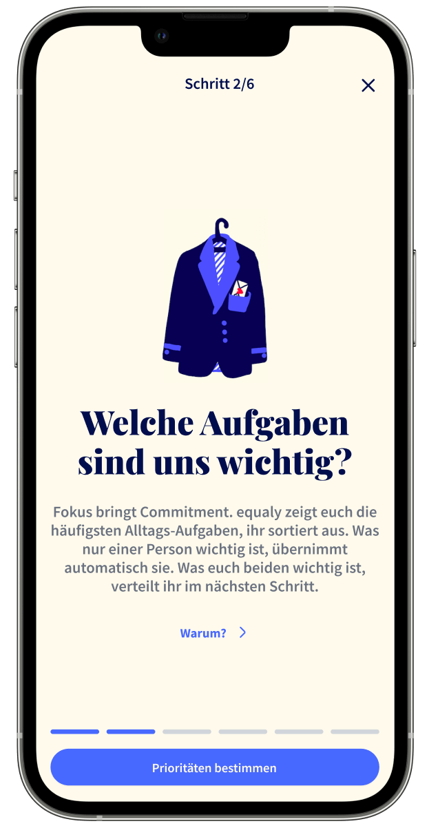
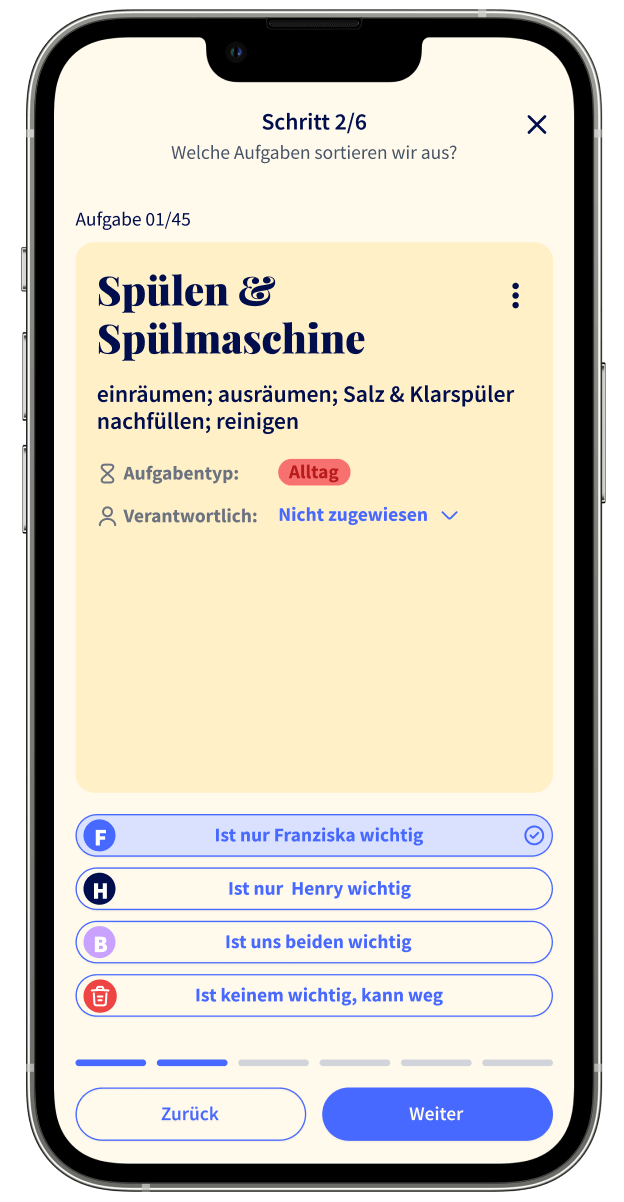
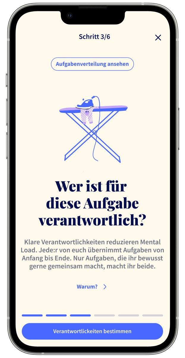
Challenge 2
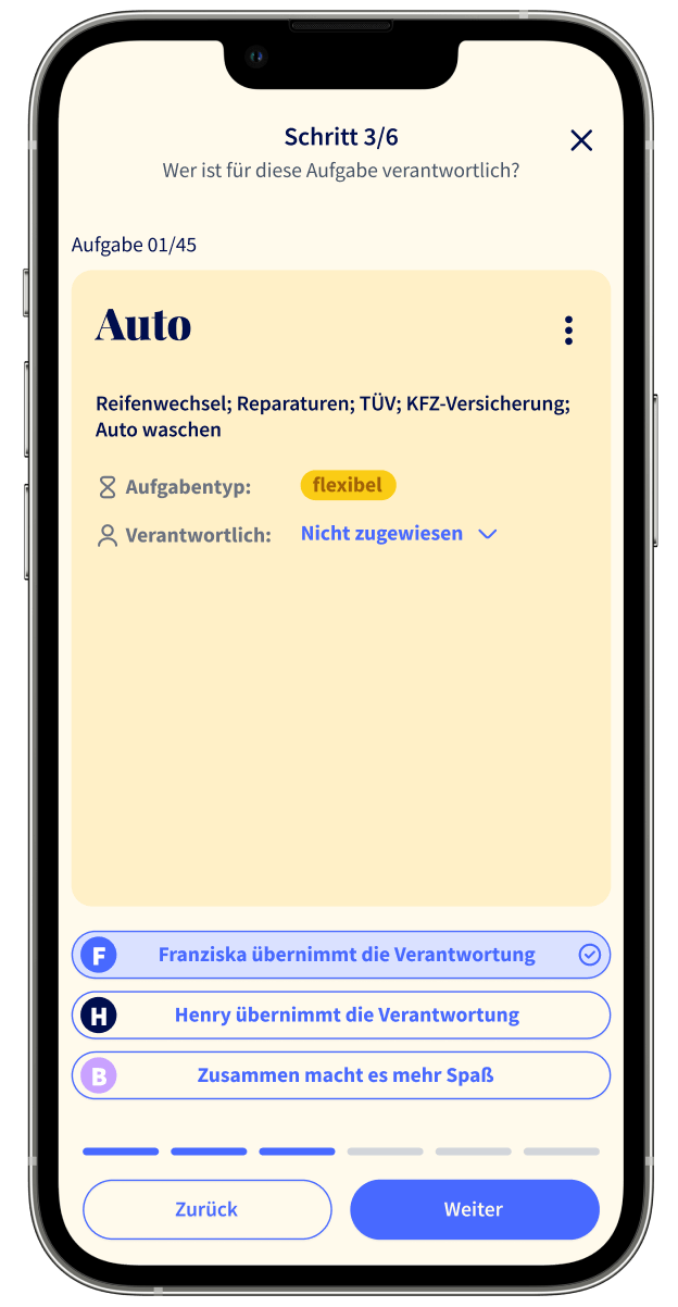
Introducing step-by-step gamification for a fun care work experience
Problem: The task distribution was unengaging and presented a text-heavy format.
Solution: Implemented a step-by-step process with stackable content, a quiz format, and a gamified approach.
Outcome: Increased user engagement and understanding, making the process fun.
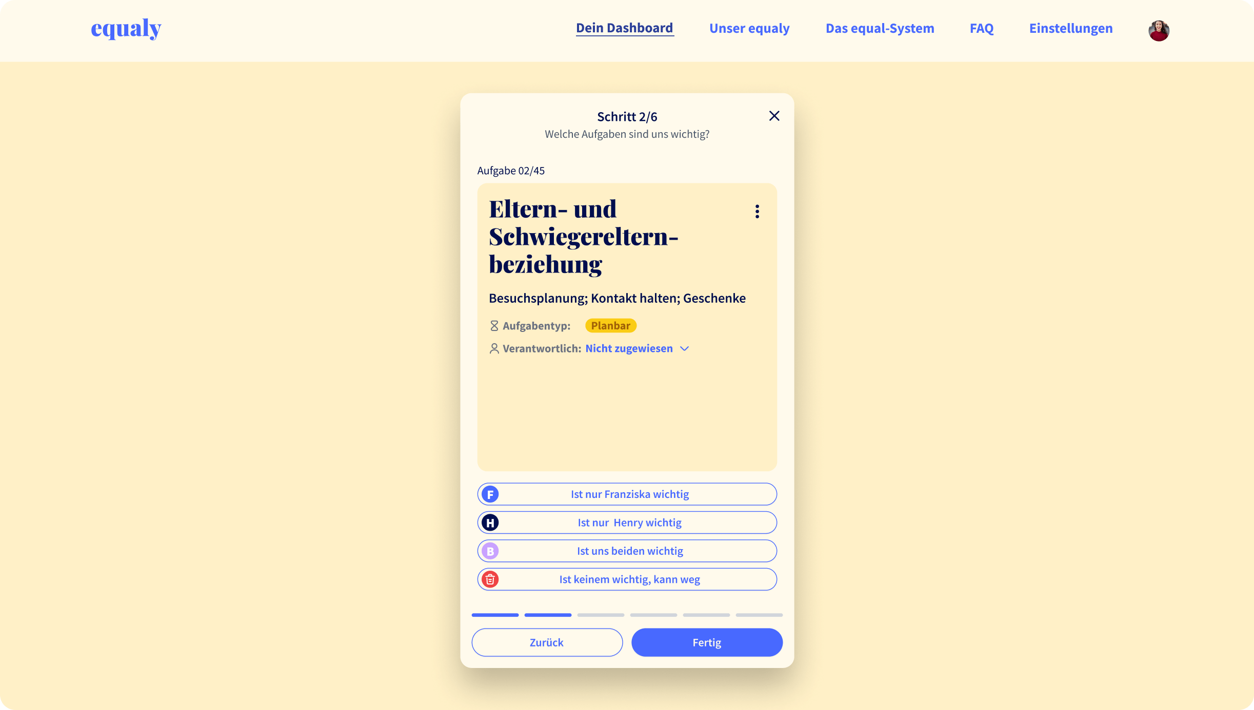
Challenge 2
Quiz approach, snackable content and clear wording
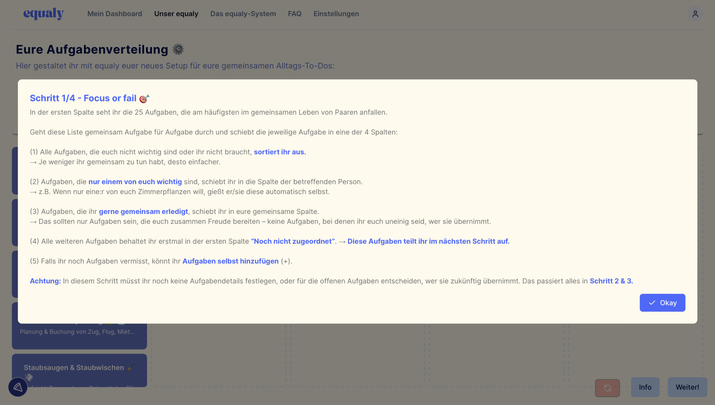
The Who-Cares-Session, where couples distribute care work responsibilities, was text heavy and lacked visual hierarchy and engagement. The goal was to create an engaging, visually appealing process that simplified and clarified the content while maintaining depth.
The solution was to break the process down into a step-by-step journey over six chapters. By simplifying the information, I ensured that only essential information was presented, with the option to delve deeper if desired. I made sure that the information hierarchy always presented the most important information first. In addition, I worked to clearly label call-to-actions and engaging questions.
Introducing a gamification element through quizzes made the process interactive and fun. By simplifying the information hierarchy and using a quiz format, the game became an easy-to-use and fun activity that fostered engagement and understanding.
These changes were not just about aesthetics, but about strategically improving the user journey.

Process
From concept to clicks: The design steps I took
1. Kick-off workshop: Aligning with the client and defining the product strategy.
2. Research methods: Utilizing competitive and analogy analysis, product reviews, and user feedback evaluations.
3. Look and feel: Selection, reduction and balancing of colors and typography for a modern look based on the existing brand. (equaly had previously used a collection of colors and typography in an incoherent manner).

4. Ideation and design: Redesigning of the dashboard and task distribution UI/UX, providing three different design directions in Figma. Using analogies like Tinder and analog card games.
5. Feedback loops: Three iterative feedback sessions with the client using a comprehensive feedback matrix.
6. Prototyping and user testing: Creating a high-fidelity prototype that was tested by a user researcher to get feedback on the overall usability. The new design experience was very well received, but users wanted to see where the journey was going.

8. Design system: Creating a style guide, incorporate typography, colors and components into a design system based on the atomic design framework.
7. Refine and finalize: Based on the test insights, I added an overview to prepare them for what’s to come and made 6 steps instead of 4.

Refelction
Evaluate the process and outcome: A Journey of creative ideation and scope adjustment
Looking back on the project, the conceptualization phase was particularly fun, drawing inspiration from unconventional sources like Tinder and card games. The initial plan was to implement a task filtering option for better organization, but this fell outside the scope of the first round.
Ideally, a more rigorous UX process would have included the creation of personas, a low-fidelity prototype, and the development of wireframes. However, due to time constraints, the pragmatic decision was made to jump directly into the design process based on the rich insights from equaly’s user research. For the sake of efficiency, I chose a high-fidelity (rather than low-fidelity) as the starting point.
Finally, my design process was still in line with the overarching goal of delivering a visually impactful and user-friendly solution.