
Client
CrowdInsights
My responsibilities
UX/UI Design
Branding/Visual Identity
Concept
Tools
Figma
Photoshop
Midjourney
Year
2024-2026
CrowdInsights is a scalable participation platform enabling municipalities to manage complex civic engagement. It is used to involve citizens in urban planning processes, idea submissions and public discussions.
The platform supports qualitative and quantitative participation, as well as map-based interactions. Each project can be configured individually depending on the needs of the municipality. Over 100 municipalities and public organizations use the platform, involving more than 100,000 citizens and stakeholders.The platform is built as a white-label system, allowing cities to adapt branding and communication styles while maintaining a shared UX architecture.
My role as the lead designer
End-to-end product design
UX architecture and interaction patterns
User flows and high-fidelity UI design
Design system and UI kit in Figma
User testing, synthesis and iteration
Branding and visual design


IMPACT
A fragmented system became a coherent and scalable participation platform
Over time, the platform had grown organically, leading to inconsistent interaction patterns and increasing complexity.
The redesign introduced a modular architecture and unified design logic, resulting in:
Consistent usability across participation formats
Different formats now follow the same interaction logic, making participation predictable and easier to understand.Improved orientation in complex, content-heavy projects
Users can more easily identify where to participate and where to find results, even when large amounts of information are present.Reduced effort for administrators
A modular “builder logic” allows administrators to configure participation projects more efficiently, supported by reusable templates.Scalable white-label system
Municipalities can customize branding without affecting usability or interaction patterns.
User testing confirmed that participation became easier to find and more intuitive to use, even within complex project structures.

PROBLEM
Organic growth and client-specific adaptations resulted in inconsistent interactions, complex structures and limited scalability
Building on an existing platform that had evolved over time, these challenges became apparent through user feedback and insights from our project managers who are closely working with the clients.
Inconsistent participation formats limited usability and scalability
Each participation format (survey, map, consultation) followed its own interaction logic and structure.Users had to relearn how each format works, while administrators had to configure each format differently. This led to confusion, increased setup effort and made it difficult to scale the platform without building custom solutions.Process-driven structure made participation hard to understand and difficult to find
Project pages were structured around internal administrative processes that are non-linear, vary between municipalities and often include irrelevant steps for citizens.
At the same time, projects combine large amounts of information with multiple participation formats that run at different times and have different statuses.
As a result, users struggled to orient themselves and identify where and when they could participate.The platform needed to work for a broad audience with varying abilities and expectations
The platform is used by a wide range of citizens with different levels of digital literacy.
Complex structures, unclear terminology and non-intuitive interactions created barriers, making it harder for some users to understand and engage with participation.Customization across municipalities lacked a scalable and consistent system
Each municipality requires its own branding, communication style and project setup.
Without a structured system, this led to individual adaptations, inconsistencies in the user experience and increased effort for both design and development.
SOLUTION
1 | A modular system enabling scalable and flexible participation formats (reusable interaction system)
To simplify the overall product experience, I mapped all existing participation formats and broke them down into their fundamental building blocks. Previously, each tool (e.g. survey, map, consultation) followed its own logic and interaction flow. This created inconsistency for users and made it difficult for administrators to build and scale participation projects.
I created a structured overview of all recurring elements across formats (see figure), including:
question formats (input types such as multiple choice or free text)
outputs (citizen contributions)
analysis tools (tools for administrators to evaluate inputs)
outcomes (aggregated insights from the analysis)
participation results (overall results based on accumulated insights)
Based on this, I introduced a module system. Each participation format/ participation module contains one or more of the above named elements. So every participation module, whether a survey, map or a consultation, follows the same structural logic. Only the content changes, not the structure.
In practice, this allows complex projects to combine different types of input within one coherent experience. For example, a park redesign project can include: marking locations on a map (e.g. where more flower beds are desired), answering qualitative questions (e.g. ideas for improving the park) and selecting options in a survey (e.g. frequency of park usage)
This reduced the need for custom-built solutions and enabled the platform to scale by recombining existing elements rather than adding new ones.
For administrators, this significantly reduced complexity while increasing flexibility:
they can create fully custom participation formats by combining modular building blocks
or use predefined templates for common participation scenarios
participation formats no longer need to be learned individually, as all follow the same underlying logic
SOLUTION
2 | Structuring complex participation projects around user intentions to make participation easy to find (information architecture & interaction design)
Public sector projects combine large amounts of background information with multiple participation formats that run at different times and follow non-linear processes. This makes it difficult for users to understand where they are and where they can participate.
Previously, the project page interface mirrored internal administrative processes. These are often non-linear, vary between municipalities, and include steps that are not relevant for citizens. As a result, users struggled to orient themselves and identify where to take action.
The redesign replaced this with a structure based on three key user intentions:
inform
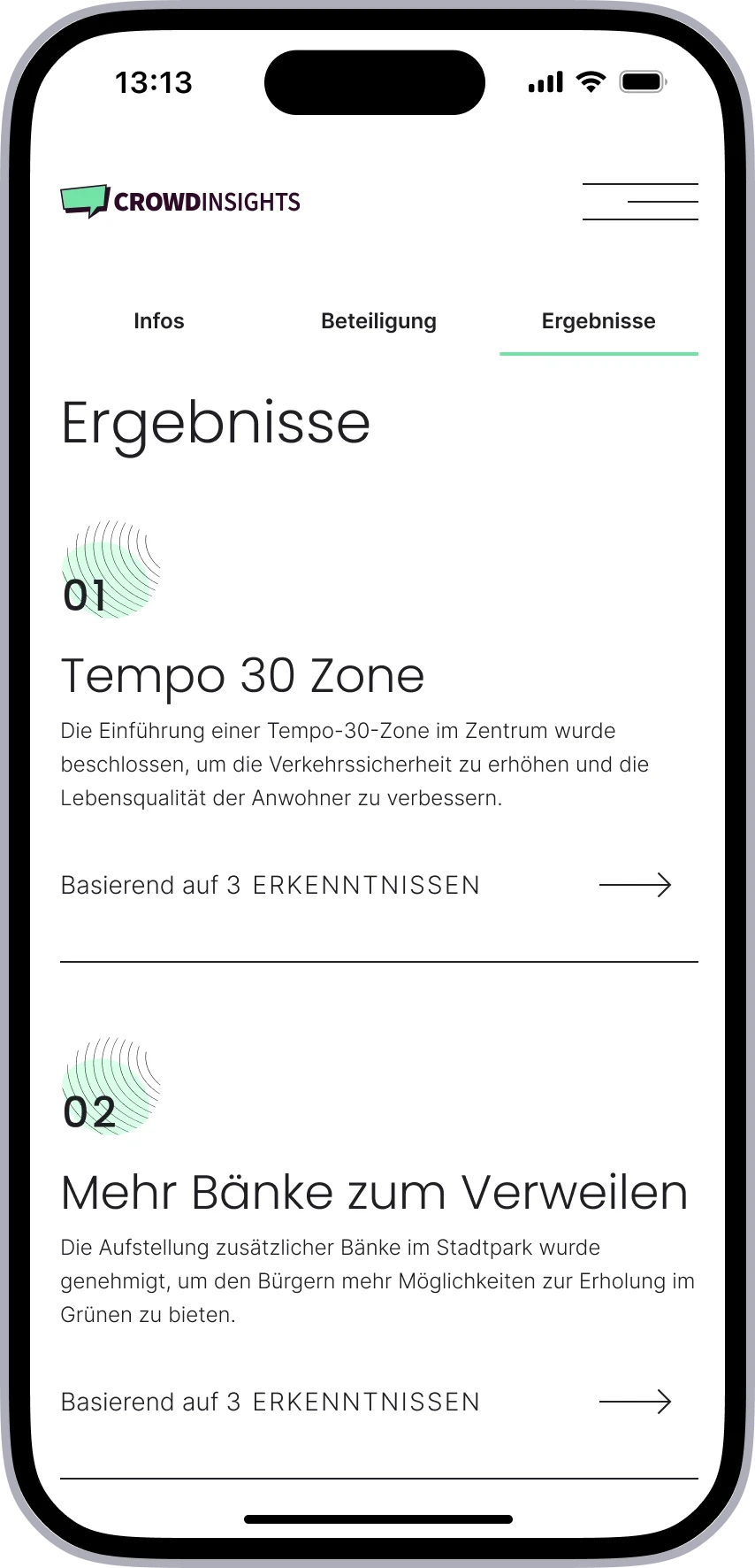
participate
view results
All content is organized accordingly, aligning the platform with how users actually approach participation: understanding a project, contributing, and reviewing outcomes.
This structure is not only reflected in the content grouping of the page, but also mirrored in the anchor navigation, reinforcing orientation and making key actions easy to access.

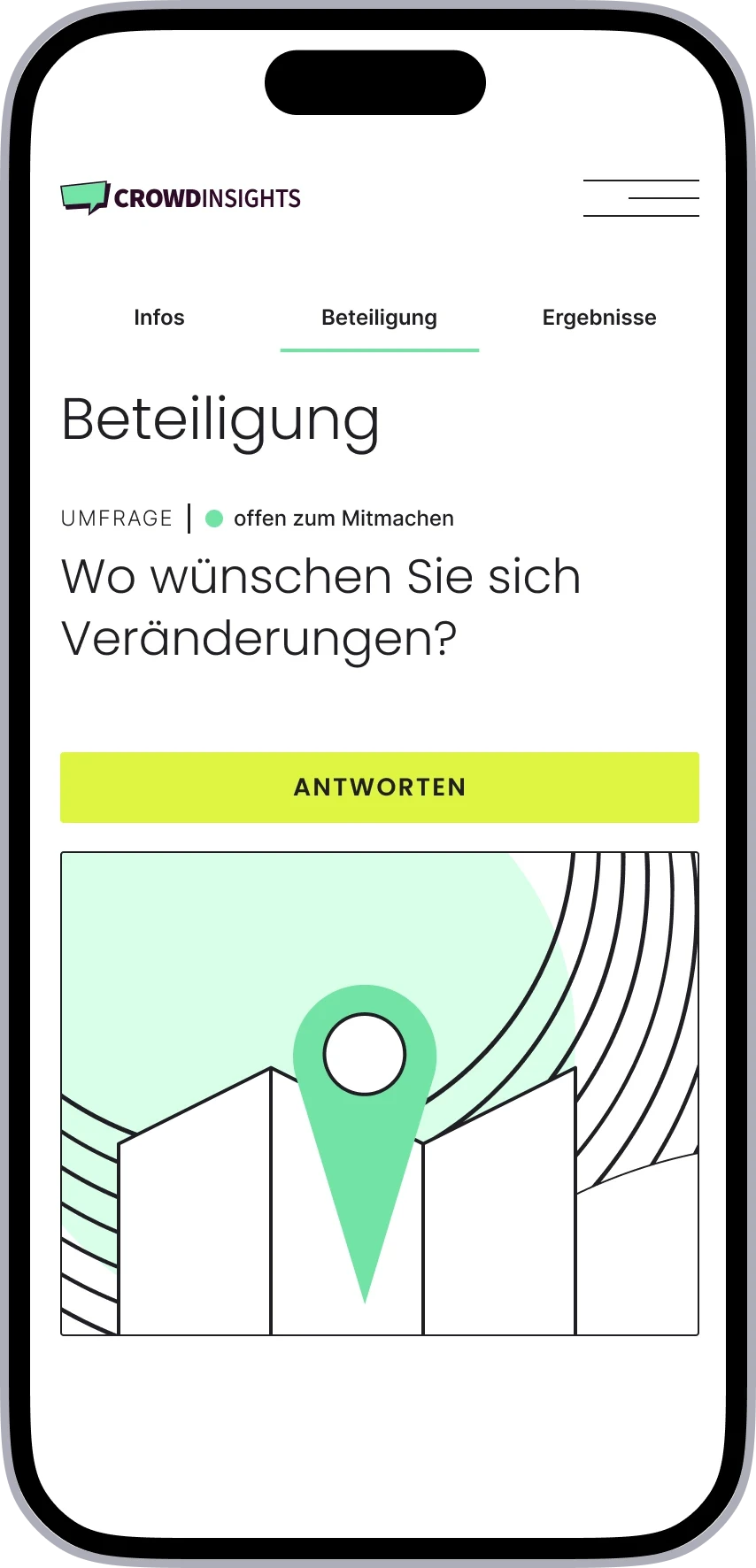
Participation is treated as the central action:
users can access participation via quick actions, scrolling, or anchor link navigation
anchor links remain sticky, keeping entry points visible at all times
participation becomes discoverable without users actively searching for it
A key design decision was to keep the entire experience on a single page.
Keeping information, participation and results within one continuous flow allows users to move directly from understanding a project to taking action, without navigating through multiple pages or process steps.
Alternative approaches such as tabs, separate module pages, or process-based structures were explored but rejected, as they either hid important content, increased navigation effort, or did not reflect user behavior.
SOLUTION
3 | Ensuring accessibility across a broad and diverse user base (accessibility / inclusive design)
The platform is designed for a broad audience with varying levels of digital experience. Accessibility was treated as a core requirement, especially in a public sector context.
Key decisions included:
High contrast and readable color usage (WCAG 2.2 AA)
Typography relies on accessible system colors, ensuring readability across themes, including dark mode.Clear typographic hierarchy and text-based content
Structured headings support scanning and screen readers, and no critical information is embedded in images.Simple, predictable interaction patterns
Interactions are designed to reduce cognitive load and support users with different levels of digital literacy.
SOLUTION
4 | Enabling scalable customization through a white-label system (design system / theming architecture)
To support multiple municipalities with different branding requirements, the platform was built as a white-label system.
A default design provides a clear and minimal foundation, while allowing controlled customization:
brand colors can be adapted without affecting usability
typography can be adjusted to match city identity
visual elements follow defined rules to ensure consistency
At the same time, key elements such as interaction patterns, component structure and system logic remain unchanged.
This allows municipalities to create a distinct visual identity while maintaining a consistent and scalable user experience across all implementations.
PROCESS
Translating complex requirements into a scalable system through iterative design
I combined system mapping and conceptual work with iterative prototyping, close collaboration with product management and engineering, and validation through user testing.
Mapping and deconstruction of existing participation formats
Breaking down all formats into recurring elements (input types, outputs, analysis, results) to identify patterns and define a modular systemConcept development and system architecture
Developing a unified participation logic and defining reusable templates and building blocks for both admin configuration and citizen interactionWireframes
Exploring different structural approaches and interaction patterns, including navigation concepts (e.g. anchor-based vs tab-based)High-fidelity prototypes
Translating the system into clear, accessible interfaces, defining layout, hierarchy, and visual patterns for content-heavy participation pagesUser testing and validation
Qualitative usability testing with citizens to evaluate navigation, participation flows and system understandingContent testing and terminology validation
Card sorting and wording tests to align labels and participation formats with user expectationsIteration and synthesis
Synthesizing and analyzing usability test results, and continuously refining the product based on user feedback, stakeholder input and product constraintsCross-functional collaboration
Close collaboration with product managers and developers to ensure feasibility and align system logic with technical implementation


USER RESEARCH
Applied a user-centered design approach through testing, synthesis and continuous iteration
To validate the redesigned platform, qualitative usability tests were conducted together with colleagues.
Participants completed a set of core tasks using a mobile prototype. The participant group ranged from 29 to 71 years.
Overall, users were able to navigate the platform and complete participation tasks, confirming that the core structure was working well. At the same time, testing revealed a few areas where clarity and understanding could be improved. Younger participants navigated quickly and intuitively, while older participants required more time and occasional support.
Participation was accessible, but required clearer structure and orientation
Users typically started by scrolling to understand the page before taking action.
While this allowed them to eventually find participation options, it showed that structure and hierarchy could be clearer.
Adjustments
content hierarchy was refined to match how users naturally approach a project: first understanding what it is about, then participating, then viewing results
sections were structured more clearly through white space to guide users toward key actions
Participation was discoverable, but the system logic was not always clear
Users understood that they could participate, but did not always realize that multiple participation formats could exist within one project.
Adjustment
multiple participation formats were grouped into a single, coherent survey flow where possible
For edge cases where multiple formats are active at the same time and cannot be comprised in one survey:
modules were sequenced and numbered (1/2/3) to make progression visible
follow-up participation is introduced directly after completing a module
This made the participation logic easier to understand while maintaining flexibility.
Wording caused friction, not interaction
Several usability issues were caused by unclear terminology rather than interaction design.
To address this, card sorting exercises were conducted and users were asked how they interpret labels and participation formats.
Adjustment
abstract or administrative terms were replaced with more intuitive, action-oriented wording
e.g. “Offen zum Mitmachen” instead of “Aktiv”
This ensured that users understand what they can do without needing additional explanation.
USER RESEARCH
A scalable design system as a foundation, enabling consistent white-label implementations
To support multiple municipalities, the platform is built on a modular design system. It defines color tokens and theming logic, typography and layout rules, as well as reusable UI components and interaction patterns.
This enables flexible branding for different cities while maintaining a consistent user experience across implementations. At the same time, it allows new projects to be set up and scaled efficiently without redefining core design principles.
A detailed example of how the system is applied in practice is shown in the Stuttgart design system documentation, which is documented separately.

