

Client
Hasso-Plattner-Institut (today https://dbildungscloud.de)
My responsibilities
UX/UI Design
Design Thinking
Communication Design
Tools
Figma
Sketch
Adobe Illustrator
Adobe InDesign
Plant
Awards
WSA Global Award
Year
2019-2021
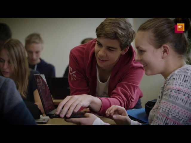
The HPI Schul-Cloud is a nationwide, award winning digital learning platform developed at the Hasso Plattner Institute. During the COVID-19 pandemic, it became one of Germany’s key infrastructures for digital learning.
I want to share the Impact of the Project and 4 of many subjects I worked on:
Course Content – restructuring how teachers prepare and present lessons.
Learning Spaces – unifying courses and teams into flexible virtual classrooms.
Design System – creating a scalable, consistent design foundation across 16 federal states.
UX Team Processes – establishing collaboration structures in a rapidly growing team.
IMPACT
From 300 to 4,000 Schools — and a World Summit Award
The Schul-Cloud scaled rapidly during the pandemic, growing from around 300 schools in February 2020 to nearly 4,000 schools and 1.4 million users by September 2021.
In 2020, the Schul-Cloud also received international recognition: it won the World Summit Award in the Learning & Education category. The jury highlighted its didactic flexibility, user-friendliness, and ability to support both synchronous and asynchronous learning. Most importantly, they praised that during the lockdowns, pupils using the platform were still able to reach their learning goals — a strong validation of the platform’s impact on digital education.
Teachers and students reported that the redesigned flows were clearer, less click-heavy, and better aligned with real classroom dynamics. The platform became a reliable foundation for hybrid teaching when schools urgently needed digital solutions.
1. Course Content – Bringing structure back to teaching

PROBLEM
Scattered materials slowed down teaching process
In the original Schul-Cloud, lesson materials were fragmented. Assignments, documents, and files were spread across different tabs and sites, while student submissions were hidden in another part of the platform. The experience was klick-heavy.
For teachers, this meant lesson preparation was time-consuming and confusing.
For students, it broke the flow of learning and made it difficult to understand how everything connected.

SOLUTION
One space for all course content
I designed a unified Course Content section where assignments, documents, and files could live together. Teachers could structure lessons and topics with headings, hide or show elements depending on context, and quickly add new materials with a default drop section. Each element also displayed a clear status indicator — such as whether it was new, in progress, or completed — so both teachers and students could immediately see the current state of the material.
Why it matters: This approach mirrors the way lessons work in a physical classroom. The teacher gathers all materials in one place, and students know exactly where to look. It created a single flow for both teaching and learning.
Outcome: Simpler, faster, clearer. Teachers described the redesign as more logical and intuitive. It reduced clicks, made lesson preparation faster, and gave students a much clearer overview of their assignments.

PROCESS
Designing with both teachers and students
I combined collaborative workshops, which I took a leading role in, with iterative prototyping and testing.
Methodology
Personas, paper prototypes, and wireframes (see more info in the article about personas I published with my colleague Döminik Brüchner)
Co-creation workshop inluding A/B testing, card sorting and design thinking workshop with students and teacher in cooperation with MINT-EC. I conducted a Design Thinking workshop with students, which I pushed for, since I felt the student perspective was often overlooked
Moderated usability tests with teachers
Feedback loops using a structured feedback matrix
Testing insights and adjustments
Feedback showed students and teachers found the new structure more logical and less click-heavy simplified flows and reduced steps.
There were minor issues with clarity because teachers did not understand the difference between filter and sorting terms. Eg does “completed” mean a task has been submitted or finished. As a result we clarified the wording and visually separated filters from sorting.


2. Learning Spaces – Rethinking digital classrooms in times of change

PROBLEM
Two systems broke the flow of learning
The Schul-Cloud had grown into a patchwork. Courses were used for teaching, while Teams supported collaboration — but they worked differently and offered inconsistent tools. For teachers, this meant duplicating work. For students, it meant breaking out of a course just to collaborate in a team, disrupting the flow of learning. For developers, it meant maintaining two overlapping systems with redundant complexity.
With the COVID-19 pandemic, the situation became even more urgent: classes were suddenly split between in-person and online, and schools needed seamless digital spaces to support hybrid teaching. At the same time, new funding became available, which gave us the resources to finally pursue what had long been a vision — rethinking the platform’s fragmented architecture into one unified model.

SOLUTION
A unified multifunctional learning space for hybrid teaching


PROCESS
Conceptualizing a unified learning experience in a team
The idea for Learning Spaces emerged as the team rethought the platform at the start of the pandemic.
Methodology
Paper Prototypes and concept boards
Workshop with the product owners, a teacher, another designers and an UX Researcher to co-create the concept
Built on insights from earlier student workshops, co-creative Design Thinking workshop
Prototyped the new High-Fidelity-Prototype
Remote usability tests
Testing insights and adjustments
Conducted remote usability tests with 6 teachers
Overall, the prototype was received very positivel, teachers quickly understood the concept of Learning Spaces and confirmed that it solved many of the issues they faced with the old split between Courses and Teams.
Teachers wanted clarity about permissions in shared spaces, we added clearer role-based settings.
Teachers valued the idea of sub-spaces for group work, we incorporated this as a key feature.


3.Design System from scratch –
Building consistency across instances

PROBLEM
Inconsistency slowed down development
When I joined, there was no design system in place. Sometimes, different sites had different design languages and button appearances for the same function. This caused confusion for users and slowed down development because components weren’t reusable. As special challenging for the design was that there were various instances for each federal state.
SOLUTION
A consistent, scalable design system
I took the lead on creating the design system, supported by a working student and illustrator, and collaborated closely with developers.
Built a library with a theming for each federal state including typography, colors, components, I used the Themer plugin to manage styles across federal state instances (before Figma Tokens existed)
Created UI kits for desktop, tablet, and mobile
A library based on Humaaans
Worked closely with developers to ensure Figma and Storybook matched one-to-one
The design system provided a unified set of components, styles, and illustrations that could scale across devices and federal states. Its close integration with Storybook ensured design and development stayed aligned.
Why it matters: Teachers and students experienced consistency no matter which state or device they used. Developers were able to build faster and more reliably, which was crucial as the platform scaled during the pandemic.
Outcome: The system reduced friction between design and development, enabled faster cycles, and ensured a cohesive user experience across the platform.
The themings for each federal state


The UI component kit


The illustration library


4.UX Team Processes – Scaling collaboration in a fast-growing team

PROBLEM
Growth made old habits unsustainable
As the Schul-Cloud project grew, so did the UX team. What once worked with ad-hoc communication (“throwing things across the table”) broke down as the team expanded. Without clear processes, coordination became inefficient.
SOLUTION
Establishing UX collaboration structures
I set up processes that made collaboration scalable and transparent:
I introduced a clear workflow: research → ideation → prototyping → testing, that was mirrored in the file structure
Documented guidelines to onboard new designers
Established structured feedback loops (e.g., feedback matrix)
We introduced a process that structured UX collaboration without slowing it down, balancing speed with quality.
Why it matters: The pandemic meant rapid team growth. Without processes, UX quality would have dropped. With them, new designers could onboard quickly, and collaboration with product and dev teams became smoother.
Outcome: The team became more efficient, onboarding accelerated, and design quality was maintained during rapid growth.

